Radošević - obiteljsko pčelarstvo
Client: Radošević obiteljsko pčelarstvo
Agency: Mit dizajn studio
Agency: Mit dizajn studio
Concept
Honeycomb is a precisely and meticulously built place, made by honey bees in order to reproduce and store honey. Bee's success depends on the quality of the honeycomb, and also the beekeepers success in the preparation of honey. Just like bees, family Radosevic persistently, precisely and meticulously care of their bees and apiaries to produce highest quality bee products. Power of the brand and visual communication is very important for market competition and the struggle for recognition among customers.
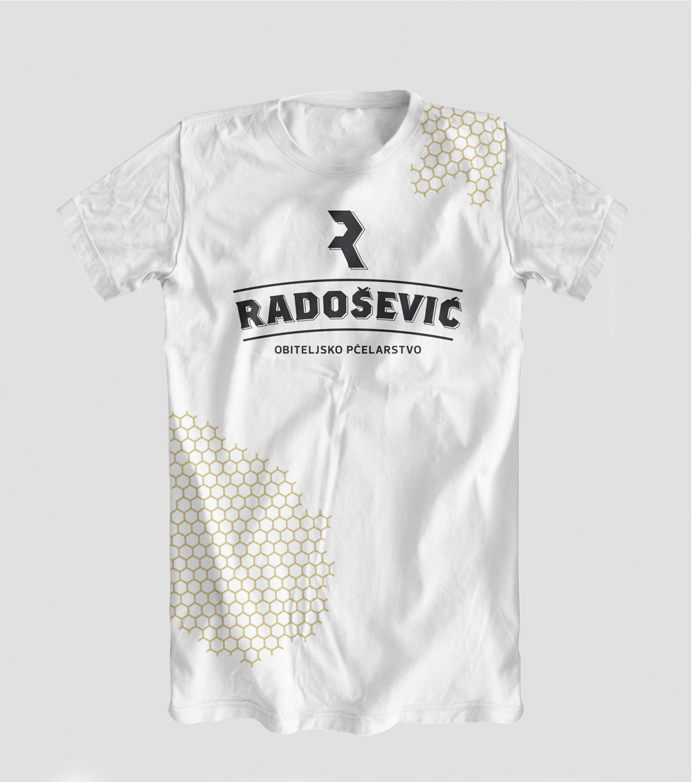
Radosevic products logo has the following logical way direction. One element of the honeycomb hexagon is duplicated and his parts are used as initials to create the logo. Being that simple, logo gives excellent direct symbolism and recognition of the company name Radosevic as a family tradition of beekeeping.
Besides producing honey, Radosevic Family Beekeeping also produces a wide variety of bee products.
Logo must be suitable and applicable on different types of packaging and also be able to communicate with a wide range of consumers. For this specific reason, the logo design should present the functional product of honey as well as other products from the range: propolis, royal jelly, brandy-honey, tea, pollen,...